Saturday, 29 September 2012

Looking at different logo designs

The BBC:

The BBC's logo uses a basic colour scheme of dark red and white. The logo consists on the letters BBC written in bold font within 3 white squares. Although it’s a simple logo its effective in that it stands out and can be recognised easily by the public as the BBC has become one of the most distinctive brands internationally, now used across a variety of platforms and recognised with immediacy and clarity by millions of people around the world.


CNN:


The CNN logo consists of a very definite structure to impose power; it is featured in a gracious fashion, illustrating every character of the CNN logo. The CNN logo is shaded in red, the red tint signifies the authoritative character of the brand. The inscribed initials ‘CNN’ are merged together in the CNN logo as it’s written in joint form this also brings forth a calming effect as the letters are smoothly joined together. The fonts are in bold typeface and truly depict the strong attitude held by the CNN Company. CNN logo has maintained a stable representation over the years. The CNN logo provides an elegant network identity which enhances the company attributes. 

itv NEWS :


ITV News.svg


The colours of yellow and black integrate the brand more closely with ITV1 as a channel, instead of ITV as a whole. The logo which added a gradient and rounded corners to it in 2010 has become a more bold and powerful logo, as well as showing its viewers that itv NEWS are current and upto date with technology. In some ways it shows its views that it means business, ITV News adopted the new design as well - reaffirming the fact that the brand is now meant to be closely affiliated with ITV1 as a channel.

Sky NEWS


The Sky News logo changed its direction from up and down to horizontal direction. The Sky News logo uses a simple red, white and black colour scheme that has an impact because the brand itself is a well-known all over the UK. The current logo has gradient and rounded corners which emphasises its power, and commands the attention of its viewers. This current logo was gradually phased in during April and May 2010. It first appeared for the Sky News Election Debate on April 22. It was launched in full on May 6, 2010.

     
News
 
Channel 4 News.svg 

The channel 4 news logo incorporates the channel 4 logo of a 3D '4' which allows for its audience to know that it associates itself with the channel. The logo uses a colour scheme of purple and white which is different to the typical colour schemes of other news channels that usually use red, blue or white. In some ways this diverse colour scheme draws in the channels usual audience but attracts a new range of viewers, a younger audience.

From looking at all these news logos we have discovered that a simple look has more of an impact on the audience becaue it presents a powerful, strong look and isn't in your face.


Sayonara 
Joycelyn

Blogging from the iPhone

Well today I downloaded the blogger up so I can blog whenever and wherever so I thought I'd update the blog with the events of yesterday. Yesterday at school James brought his laptop to school to show us how mic of the title sequence he has animated and it was amazing he had like a purple 3D circular thing moving around the screen as the clips appeared o the screen.

Whilst all this was happening I was working on sharing our previous title sequence to post on the blogger later on, to show our blogger viewers the first draft of out title sequence before James worked his magic on it.

Ollie on the other had was updating the blog that day. Tabz was working on updating the website, the layout making sure the colour scheme matched our blog and logo.

sayonara
Joycelyn

Thursday, 27 September 2012

Day 1 of filming

Team: Joycelyn and James
Locations: Kings Cross Station, The British Library & The Royal Parks (Regent's park)

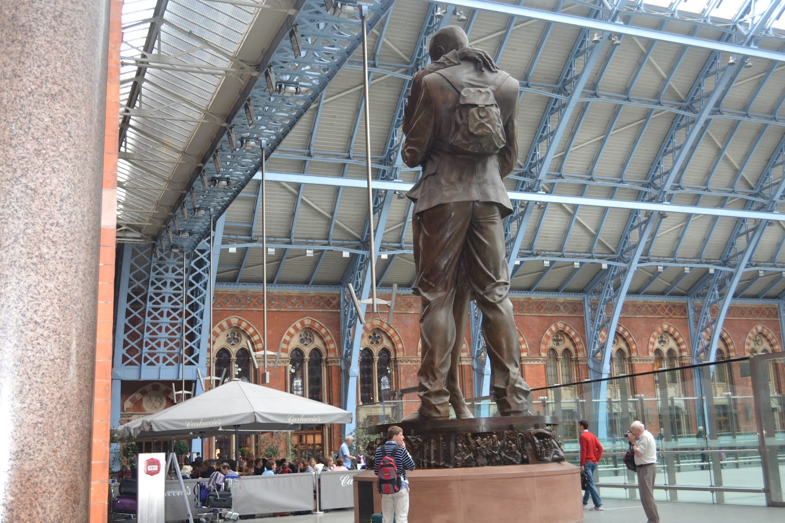
Kings Cross Station


On our 

In St. Pancreas we saw this!!!!


The statue upclose


 The British Library


Regent Street:


The Royal Park: simply beautiful


sayonara
J.A.

Exploring london part 2 (architecture and more..)


Location: Bank

We decided to go to Bank because its a massive tourist attraction in the city of London as well as it being a place full of architecture.


As we walked along the streets getting closer and closer to the gurkin an icon building in London, which has been known to attract tourist because of its unique shape and design.  


This unique sculpture was very unexpected sighting on our journey through Bank. It added an new element to the area as you wouldn't expect to see such a creative imaginative pieve of art in such a business related area. It had colour to it and was divers making it tand out amongst the large amount of glass building.

Location: A park in Aldgate

This park in Aldgate wasn't a planned stop but a place where we had lunch, whilst we were there we discovered this amazing oriental sculpture, it was at the top of the park right infront of these modern flats. The sculture added a new element to the park making it a tourist attraction.

sayonara
Joycelyn

Researching News Openings


James here,

To get an idea of creating an opening sequence, researching contemporary openings: BBC and Sky News, we chose BBC for the graphical transitions, abstract and different levels of opacity.  


This screen shot shows the graphics are applied in different layers. The background has transparent 'strokes' as of contrast to the bold reds in the foreground, also the layers form to be an 'Earth'. The circles also portray the beats in the opening theme song, a pulse.


The final shot shows the well-known logo of BBC. As of most people read starting from the left, the logo is placed next to the final animated globe rotating with different tones of red and black. Due to our local location, a globe is not ideal. Showing landmarks and local pedestrians would seem appropriate to include and to emphasis the london location.


Monday, 24 September 2012

Exploring London for inspiration Avec James

Location: Brick lane

We decided to go to brick lane because its an area with variety of different people and cultures as so we knew that there would be unique displays of art around the area.


Walking into Brick Lane we saw a variety of street art. It allowed us to see that art can be found in a wide range of places and not just galleries. This imaginative piece of graffiti shows us the link between cinema and art, this proves how cinema is a unique form of visual communication. Many people may see graffiti as form of vandalism however, some many see it as advertising. For example: in this picture you can see how the vibrant colours attracts many citizens to occurring events. Visiting brick lane helped us to understand that there's a lot more to art than what is seen in museums and galleries. This experience helped us to see that our news website needed to inform our target audience of all forms of art including street art and how it benefits our society in that it allows us to publicly express our opinions in a creative way.

sayonara
Joycelyn

Thursday, 20 September 2012

Logo Ideas


James here,

After researching multiple logos from contemporary news programs, we picked the traditional colour scheme - red, blue and white, also the colours of the Union Jack. From choosing the contrast of colours, red against white, blue with white - we decided to change the colour scheme. 


Here are the concept designs of our logo, choosing MLN as our brand (Modern London News). Purple and grey seemed to be a good contrast to use, also using a colour scheme which was unique. We immediately chose not to allow 3D text as it gave an unprofessional approach, making the font simple was our main priority.

Our final design, the pixelated arrow fitted both with our era of technology, easy to mass produce if necessary and animate. The arrow has many symbols: 'play', 'forward' or sense of direction. As an arrow is commonly shown in everyday life, however, adding our twist, portrays a distinctive emblem.
 Using Anime Studio Debute, similar to Adobe Flash, applying basic text, shapes and motion was fairly simple. Using the built-in pin-point motion, animating this was a 'drag and drop' task. This animation will appear at the end of the sequence.

Hard At Work...

Ollie: personal post
Today James and Ollie have been working on his introduction blog and music
Tabz: has been looking at the music for the title sequence as wells helping me with the construction of the blog

sayonara
Joycelyn

James Timson


I have been studying media since GCSE, from creating advertisements, photography with SLR cameras, to photoshop. Media has always interested me since I can let my creativity flow, designing logos, concept designs and graphics. With my knowledge in AS, I can extend my skills in Adobe Premier editing software, camera work, time management and planning. These will benefit me to create a news package and opening sequence as we've been asked to accomplish for A2.

James out.

Tuesday, 18 September 2012

J.A..

Through my years of studying media I now know of the different sections within the media industry, which has given me a better understanding of the terminology as well as improved my skills and has given me that extra boost of confidence to approach the general public in order to get a better understanding of my target audiences. These personal accomplishments will benefit me in this unit as we will be interviewing and mingling with the general public. Studying media at GCSE gave me a brief overview of the subject which gave me a better understanding at AS. At AS we focused on the production for a thriller opening sequence, where I was able to research and gain an appreciation of the thriller genre. I also learnt how to edit footage on adobe premier and produce a script. This year I will be constructing the blog as well as filming for the news package and title sequence, I will also help with the editing process. 

Sayonara 
Joycelyn